This week we’re shipping a few changes to our Query Builder interface. While they may appear small, they are the first steps in a larger plan that will help you more easily share your own observations about queries with your teammates, all around Honeycomb.

Query descriptions
You’ve always been able to name queries, but now you can also add a longer description to help explain the query to other folks on your team.
By default, queries are now untitled — we won’t clutter things up by naming them after the time you ran them.

Click “Untitled” to add a name, or “No description set” to add a description.

Click “Save” or hit ctrl-enter/cmd-return to save.

The name and description will show up above the query builder when your teammates view the query, and the name will show up in the sidebar in your History & Activity. Expect to see them more places in the future soon.
Query Builder UI updates
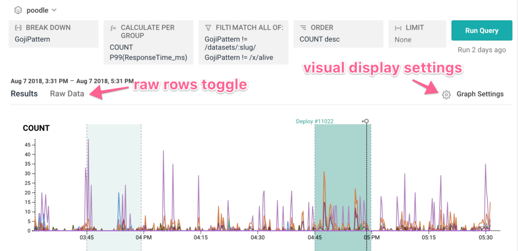
We’ve also made a few changes to the placement of some of the query builder UI elements. Controls that affect how data is viewed still live close to the graph:

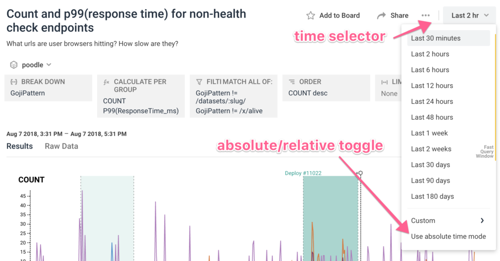
Query controls like time selection, adding to a board, sharing, and the absolute/relative time toggle now live above the graph:

New “clear query” action
We’ve also added the option to clear the query builder, if you want to start fresh and build a new query!

Happy querying! Send us a screenshot of your latest cool query results and we might send you something in the mail 🙂


