It’s already September! Time flies by when you’re getting things done, and we’ve been a busy bunch of bees here at Honeycomb. 🐝
We’re excited that we’ve gotten to share some of those changes with you already, like our relaunched interactive sandbox and the beta release of our OpenTelemetry log support and Go distribution, but that’s just the tip of the iceberg.
To keep you in the loop about all the goings on over here, we’re kicking off a regular series where we take you through monthly highlights of what’s new and noteworthy. A sort of product feature ICYMI, if you will.
Without further ado, here’s what we’ve been up to.
Better filtering capabilities
Being able to quickly query and surface correlations—even across hundreds of dimensions—is a big part of what makes Honeycomb amazing. The only problem with having so much data at your disposal is that sometimes the attributes you’re most interested in are on different pages of pagination or buried down at the bottom of a long list.
Well, we have just the feature for you: filtering!
We’ve added filtering capabilities to the BubbleUp and Raw Data views, allowing you to quickly get to exactly the information you need.
Filtering in BubbleUp
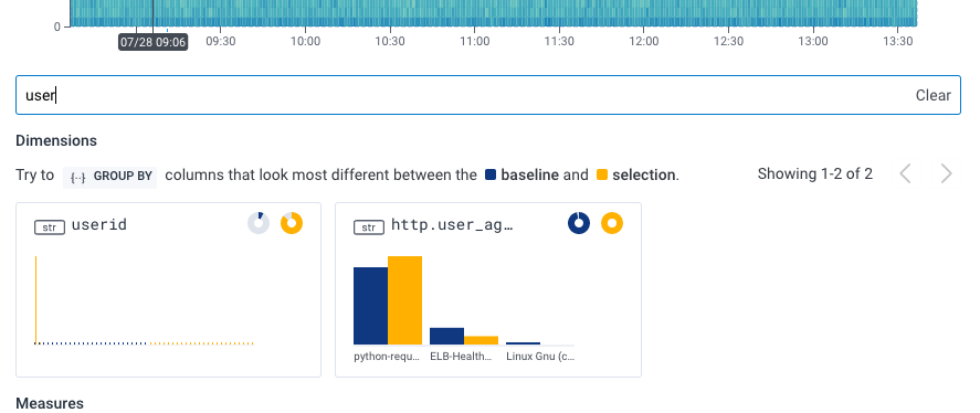
BubbleUp lets you take a query visualization, select a portion of the result, and compare dimensions in your selection against a baseline sample, showing those with the highest deviations first. When you log in, you’ll notice a new text bar above the dimensions summary where you can filter the results to a user-defined subset. This can be particularly helpful if the dimensions you’d like to compare are paginated onto different pages, making them difficult to see side by side. See the example below, where we’re showing only dimensions that contain the string user:
Filtering with Raw Data
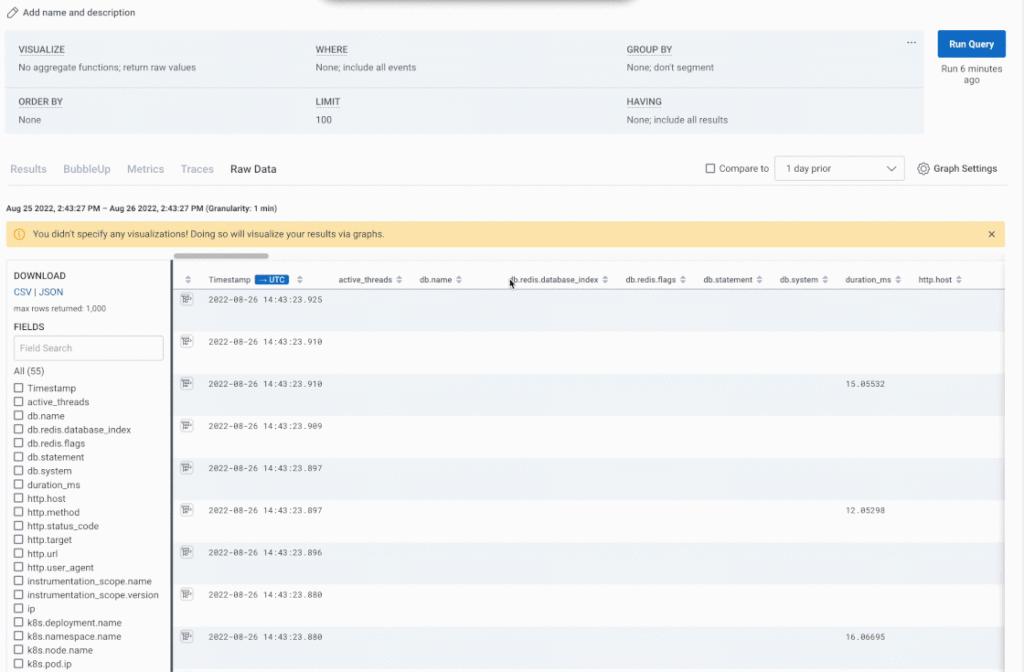
We’ve added a similar capability to the Raw Data tab. When you navigate to the Raw Data tab after running a query, all of its relevant dimensions become columns in this aggregated view. With large datasets, this can be difficult to parse, so Honeycomb provides a list of dimensions along the left-hand side of the screen where you can select which fields you’d like to display. This list can get quite long, so as with BubbleUp, we’ve added a text field you can use to filter for just the fields you want, without needing to scroll through a long list.
Experimental derived column editor
Derived columns can be incredibly powerful. They allow you to add insights to your telemetry data without needing to add any new instrumentation. If a data point can be derived from the data you’re already collecting, you can create a brand new column in the dataset to capture it automatically (and retroactively apply it to all existing events).
This could be anything from…
…a simple math calculation: “I can get a custom duration by subtracting these two timestamps.”
…to a complex service level indicator: “Okay, if a request touched my “products” service, did not result in an error, but took longer than 1000ms to complete, my customer experience might be degrading.”
The only problem is that historically, you’ve had to write these functions in a single-line text bar, which makes anything beyond the simplest of use cases difficult to parse and troubleshoot.

With that in mind, we’ve been hard at work on an updated user experience with some of the quality of life improvements that have become invaluable in many of our IDE tools. What’s more, you can try it out right now.
When you create or edit a derived column in the web UI, there is now a slider in the top right corner letting you toggle on the new experience and enjoy the comfort of a multiline editor, syntax highlighting, function and column autocomplete, error explanations on hover, and more!
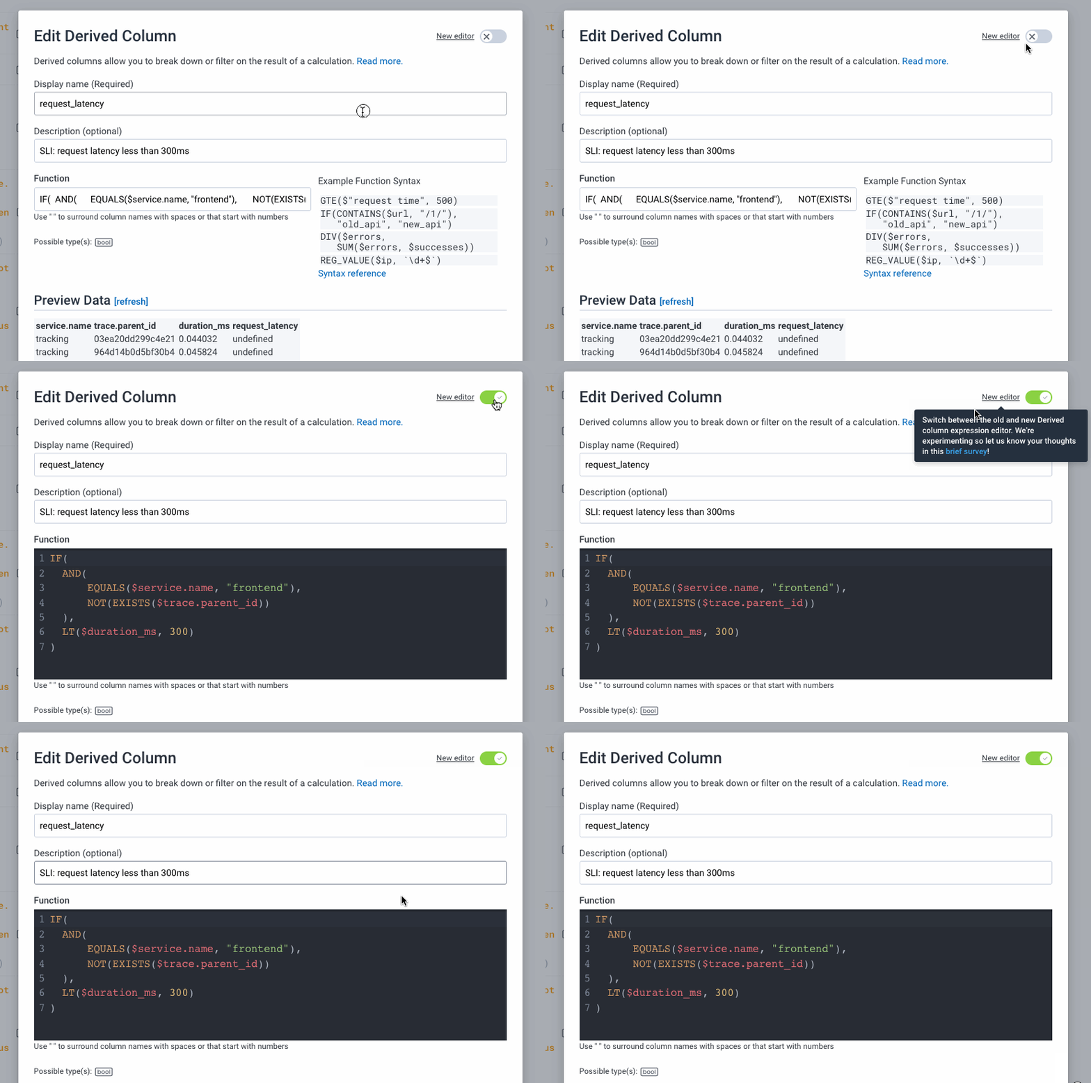
Be sure to let us know about your experience with the new editor by joining us at #ux-feedback in our Pollinators Slack, or by filling out this user experience survey.
New copy button in Honeycomb docs
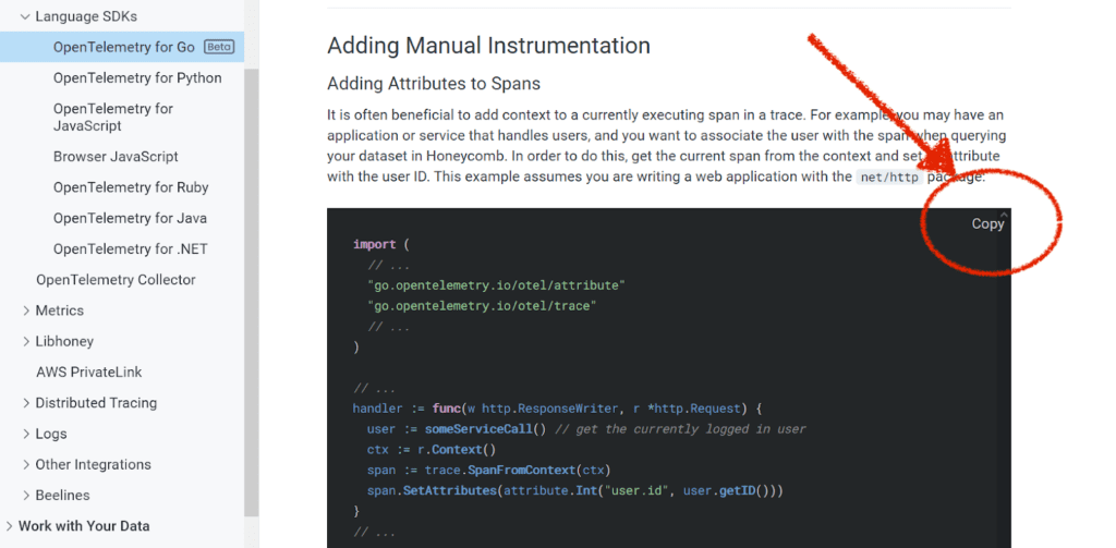
I love a good easy button, and I love copying and pasting code snippets from docs. So, it’s no surprise that I absolutely love an easy button for copy/pasting code snippets from docs. And now, we have one!
This one’s pretty self-explanatory. Wanna snag a code block? No need to click and drag, just look to the top right corner. No fuss, no muss.
Wrapping it Up
That’s it for the highlights, but you can always find a full list of updates we’ve made to Honeycomb in our changelog. We also post changelog entries to the #general channel of the Pollinators Slack and to our Twitter account under the #changelog hashtag.
See you next month!


