It’s been a minute since our last Feature Focus, and we have a bit of catching up to do! I’m happy to report we’ll resume monthly updates next month, but until then, please enjoy this super-sized winter digest of what we’ve been up to at Honeycomb.
UI, UX, and you
Back in October, we released a collection of features that gave Honeycomb users new ways to put their data to work. Most notably, a new Service Map to visualize how your services interact, and a profound update to BubbleUp that allows users to find outliers in any query. It previously was only available on heatmaps.
To follow up, we’ve made a ton of improvements to the look and feel of Honeycomb, both big and small.
Personally, I’m most excited by the new clickable chart lines in BubbleUp. When you run a query with a “group by” dimension defined, and navigate to the BubbleUp tab in the results, you can click on any of the line graphs to bubble up on that particular group of queries. It’ll even change the graph colors to BubbleUp blue and yellow to make the contrast easier to see.
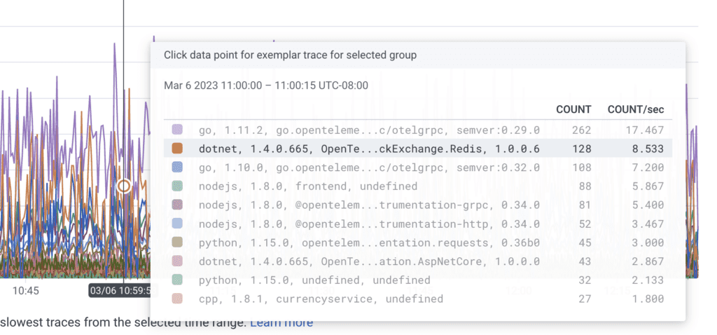
Speaking of making our visuals easier to parse, we also made a variety of graphing updates for legibility. This includes better labeling and a fix to a bug that had graphs crossing the Y axis. We also made some updates to the hover charts on our graphs to make it easier to distinguish between elements on crowded visuals.
Similarly, we made subtle tweaks to the click-to-trace functionality in the query builder. While you can click on any point in a query graph to see a representative trace, users reported difficulty clicking on the right trace in a busy graph, or being unable to click at all! Well, we made the indicator circle bigger, adjusted the snappiness of the trace picker, and have been beyond pleased with the results. You should check it out if you haven’t already.

We’ve made a few quality of life improvements to make managing your data easier. For starters, you’ll notice that your API keys will now display their created date in the settings UI. This improvement makes it easier for you to see which keys need to be revoked or rotated. We also added markdown support in SLOs and Triggers to give you a little more control over the richness of your alerts.
For a deeper dive into some of these updates, as well as a peek into our process and what’s in store for future changes, check out our recent data visualization blog.
New instrumentation and integration
It ain’t a Feature Focus without some talk about telemetry. Well, I think we can manage that!
We released another OpenTelemetry distribution SDK for auto-instrumentation, this time for Node.js—because why should the backend have all the fun?
Another subtle but important change is to derived columns. Last summer, we updated our data model to better support a dataset-per-service configuration. While this has made a number of use cases easier, one problem is that if your services sent data to a single dataset, and had a derived column defined there, you might have to recreate it on each individual service after migrating. That can get tedious. Fast. Well, worry no more! Environment derived columns let you define a derived column to apply across every service in an environment.
On the integrations front, we’ve shared exciting news on a variety of fronts. Near and dear to my infrastructure automation roots are our new Terraform integrations. You can now define your Honeycomb configuration as code and programmatically set up new environments without duplicating the work investing in existing ones. What’s more, we even have a companion tool, terraformer, that can look at an existing Honeycomb account, extract its resources, and generate representative Terraform code to recreate it.
We’ve overhauled our AWS Integrations from the ground up to drastically increase built-in support for AWS logs and metrics. And we’ve even provided Terraform and CloudFormation code to give you one-click setup for your AWS environments. You can now send logs to Honeycomb from any AWS service that publishes logs to CloudWatch Logs, as well as from select services that publish logs to Amazon S3.
Finally, we’ve added the CircleCI Integration Guide to our Resources hub. We’ll continue to bulk up our CI/CD observability how-tos, so keep your eyes peeled!
Hands-on with Honeycomb
Last but not least, we have a few new ways for you to try out Honeycomb. This is both for new users looking to get started, and existing users interested in exploring new capabilities.
First and foremost, Honeycomb Metrics are now available in Honeycomb’s free tier! That’s it. That’s the whole announcement. Start ingesting metrics if you got ‘em.
Our free preview of Service Map ended back in January, but you can still check it out even if you’re not an Enterprise customer. Heck, even if you’re not a customer at all. That’s because we launched a new Service Map sandbox to give you a hands-on guided tour of the feature—and what makes it unique among its peers.
If you ever wanted a twist on learning the ins and outs of Honeycomb’s queries and traces, we released a fun learning app over our December break called Happy o11ydays. I won’t spoil all of the fun, but the project takes a unique approach to demonstrating heatmaps in particular. It draws pictures using event density as its paint brush. It’s pretty darn neat.
See you next month!
Whew! That’s all for this heaping helping of o11y goodies. Look forward to next month when we will resume our regularly scheduled Feature Focus.
Happy observing,
Rycar


