At Honeycomb Developer Week, I got an opportunity to walk through a couple of fun new features we’ve shipped since August and ways that we’ve been able to improve Honeycomb for you.
Hearing feedback from our users and customers— through support requests, in the Pollinators community, from Twitter, etc.—helps us make Honeycomb better for you. We ship changes often (you can see updates in real time on our changelog), so it can be easy to miss some of the new improvements that can help you get the most out of Honeycomb.
In this post, I’ll share a few cool new things you can do with Honeycomb as of Q4 2021.
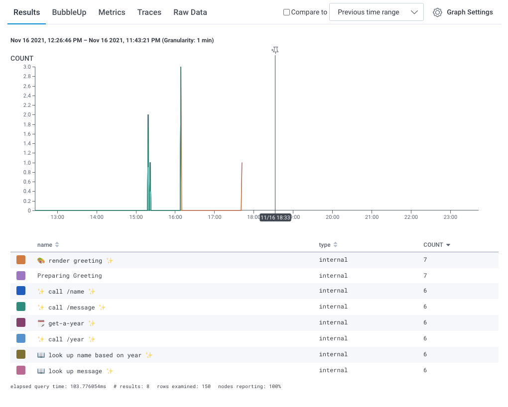
Emojis everywhere!
We love emojis. Maybe it’s our ✨✨ personality; maybe it’s our love of colorful 💚🧡🤎💙—As of a few months ago, your query results, board titles, triggers, and even event payloads all support emojis. (It turns out that this is useful for a few other reasons, too. Because full unicode character sets are now supported, neither your data nor your annotations need to be in English.)
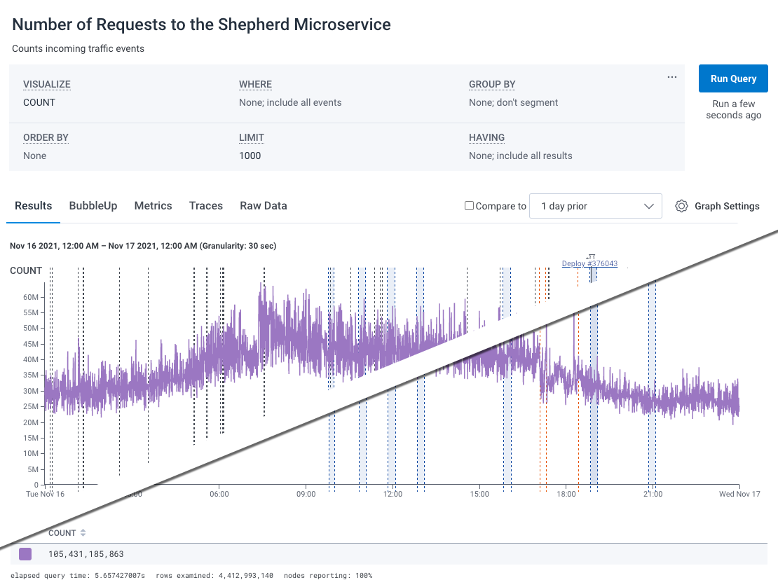
Filtering markers
Markers are great. They can be used to mark deploys and incidents, flips of LaunchDarkly flags, and rollouts of new hosts. They really help make sense of what’s happening in a service. Unfortunately, they can also get overwhelming. The new Filter Markers menu, under Graph Settings, can help you trim excess markers and simplify the chart.
Linking to spans and finding error spans
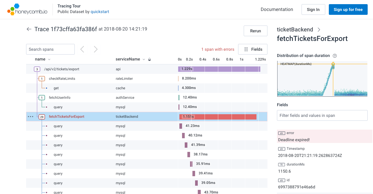
We added a few new fun features to our trace view. First, you can now link to a specific span. If you copy the URL from a trace with a specific span selected, then the next person can check it out. For example, this trace URL from our “play with traces” dataset should point you directly into this trace, with “fetchTicketsforExport” selected.
You’ll also notice that the span is drawn in a vivid red—as is its name. If you have configured your spans to show their Error field on the Definitions page, we’ll count them, highlight them, and highlight the error message. Hopefully, that makes it a little easier to find bad spans.
New aggregates: RATE and CONCURRENCY
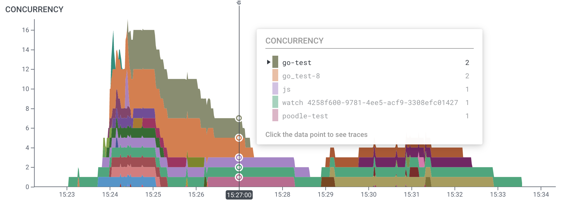
We’ve also released two new aggregates, and both of them allow you to ask questions that you just can’t in any other way!
First, the RATE aggregate makes working with metrics a much better experience. Lots of metric data comes as a counter—that might be anything from CPU wall clock time to the number of garbage collection cycles. Measuring the way that those counts change lets you watch for a sudden change.
The CONCURRENCY aggregate is subtle and incredibly powerful. It lets you measure how many things are happening at one time. It does so by taking advantage of the duration field in your data. For example, if you have one event that started at 1:00 with a duration of three minutes, and another event that started at 1:01 with a duration of one minute, then at 1:01, the concurrency would be two because we’d know about both events. You can use CONCURRENCY to track growing queues, watch how many operations are going on in a trace, or use it to create a handy trace summary.
Check out the docs pages links to learn more about both these powerful operators and level up your analysis game!
Honeycomb Search
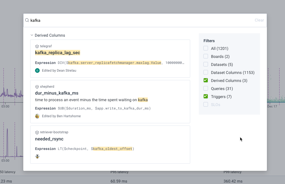
It can be incredibly helpful to chase down an issue through Honeycomb. But sometimes, when tracking an attribute, it can get confusing—is it in a field, or a derived column, or maybe someone put it together into a board somewhere? Honeycomb Search lets you dig through all your datasets, boards, and derived columns to hunt down just who has worked on it. (Try searching for someone’s name to find their past saved queries.) Get to it by pressing Control-K or / – or the search icon on the left of the screen.
Derived columns in dataset definitions
Sometimes, an impactful feature comes from a small bit of polish. You can set various dataset definitions to help configure Honeycomb to understand tracing features. Until recently, those fields could only take one field—and it had to be one sent in from the instrumentation. If you wanted to migrate from Beelines to OpenTelemetry, or make some other change, you’d have to fight with the system. You can now use Derived Columns in your definitions table, which means you can provide a column with a definition like COALESCE($service_name, $service.name) to help smooth those bumps.
The Query Data API
Sometimes, you need to see your data outside of the product. The Query Data API lets you pull Honeycomb data with API access into third-party tools. Send your data to Grafana! Query it from the command line!
Read more about it in this blog.
Delivering more Honeycomb for you
The Honeycomb product team is constantly delivering more Honeycomb to make the experience better for our users, and it’s really exciting to these new tools for instrumenting systems, analyzing data, and getting data into other places. Kick the tires on these new features, and let us know what you think—and keep your eyes open for some amazing things we’ve got on deck for 2022!
Want to check out all these features and don’t have a Honeycomb account yet? Sign up today—it’s free!


