The most common visualization for time series data is the line
graph. Seeing each group as an independent line can make it very
easy to see what’s going on relative to other lines, but line
graphs develop problems when there are many similar lines.
Honeycomb highlights the line in the graph when you mouse over
the summary table entry for that group, which can help
distinguish the lines from one another, but sometimes there’s
still too many lines to really make sense of things.
There are other visualization types that can offer a clearer view
of what’s going on for this type of data. Perhaps the most
common alternative (and the most commonly requested by users!) is
the stacked graph, otherwise known as an area chart, stacked area
chart, stacked area graph, or half a dozen other names. Here’s
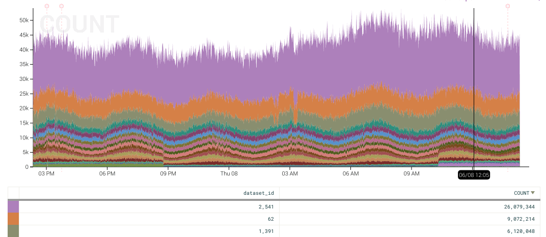
an example of what it looks like today in Honeycomb:
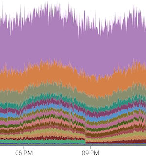
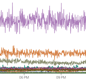
The interesting thing about this graph is that there’s a pretty
clear discontinuity at 8:50pm. The line graph is so busy (given
how many breakdowns are similarly valued) that the change is a
challenge to see:
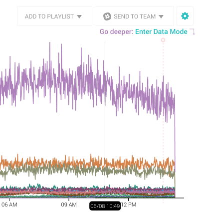
Switching between line and stacked graphs is as easy as a toggle in the gear menu:
The order from top to bottom in the area graph mirrors that of
the summary table below the graph. So purple in the above
example is the first row in the summary table, with orange below,
then olive. Changing the sort order in the table also updates
the graph so that this always holds:
Changing sort order, as is plainly visible here, can obscure or
illuminate interesting events (watch the graph at 8:50pm, 3:10am
and 10:20am), so play around and change the sort of each of the
aggregates to see if anything pops out.
What other visualization types are you most excited about? Let us know at support@honeycomb.io or @honeycombio