In the modern DevOps / SRE world, one of the most important things to get a
clear picture of is what’s happening in between your users and the applications
that serve them. Most modern “web-native” applications use a variety of
techniques and infrastructure in this middle area to be able to scale to many
users, prevent failures, and stay snappy. One such technique is the use of load
balancers which sit
in front of application replicas so that the deluge of requests can be served by
more than one computer.

In the land of load balancers, a variety of solutions have emerged, and many
users of the perennially popular Amazon Web Services have warmed up to AWS’s
Elastic Load Balancer (ELB for
short). Due to its close integration with other popular AWS products such as
Autoscaling
Groups,
ELB has enjoyed a lot of success, but represents yet another aspect of
chillingly complex modern infrastructure which must be supervised, monitored,
and observed to prevent problems.
Most solutions to observe ELB today lose granularity of data (such as the
pre-aggregated metrics you get from Amazon Cloudwatch), which makes drilling
down into specific problem areas more difficult. ELB does provide Access
Logs,
but the quantity of data on even a small website can be overwhelming, and
accessing the logs pushed to S3 by hand is clunky. As AWS themselves note:
If there is a lot of demand on your website, your load balancer can generate log files with gigabytes of data.
That’s a lot to take in just by looking at plain text files! The situation for
quickly visualizing and drilling down into data provided about Elastic Load
Balancer accesses seems dire.
That is, of course, until now. Today we’re pleased to announce the brand new AWS
ELB integration for Honeycomb for you to gain more DevOps superpowers.
Examples
The new tool, called honeyelb, has instructions for getting
started in our documentation.
Steps to get started include ensuring that the proper access credentials are
provided, which can be tricky, so as always feel free to reach out to us if you
need some help (support@honeycomb.io). In this
article, let’s take a look at some things that you can use the ingested data to
investigate.
Which backends are slow?
Let’s take a look at the MAX(backend_processing_time) (the amount of time the
ELB spent waiting on a server) with a BREAK DOWN on backend_authority (an IP
and port combination, e.g., 10.2.55.12:80) so that each distinct colored line
we see on the graph represents the value of MAX for that backend. We’ll
visualize this for the past week.
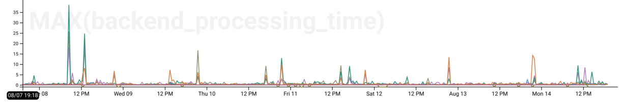
We can see that most of the time our backends are pretty speedy (the lines are
low), but there are some pretty pronounced spikes in the data where the latency
goes up to 10+ or even 30+ seconds! What’s up with that? We could, of course, go
digging in our application’s Honeycomb data, filtered by this server and in
this time range to find out–but since we now have ELB data right here too, let’s look there first.
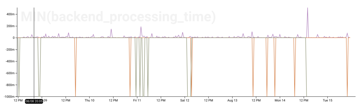
Which backends timed out?
If the backends behind the ELB time out attempting to serve a request, send
malformed requests, or close the connection before sending a request, AWS will
mark the request_processing_time field with a value of -1.
Therefore, we can use MIN(request_processing_time) to identify where the AWS
ELB is having issues talking to our EC2 instance backends. See the downward
spikes? Those are where problems occurred.
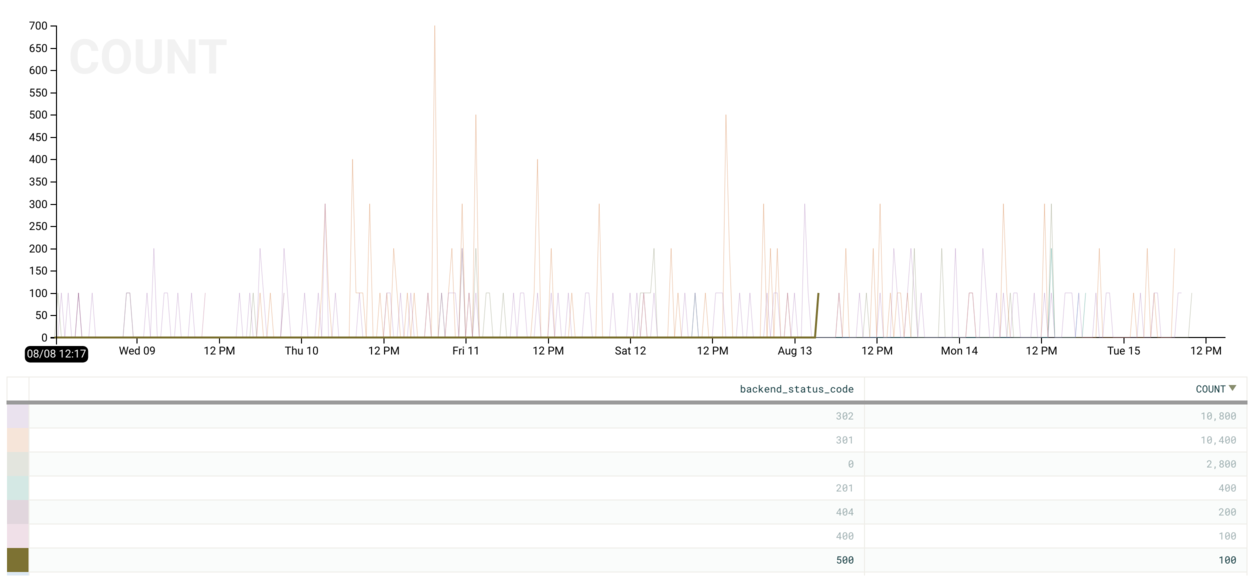
Which backends are returning non-200 status codes?
If our ELBs are serving HTTP, we can:
BREAK DOWNonbackend_status_codeCALCULATEaCOUNTFILTERwherebackend_status_code != 200
to visualize the number of “abnormal” (non-200 HTTP OK) requests. We can see if
we mouse over the graph (or look in the table view) that most of our non-200s
are in the HTTP 300 range (redirects).
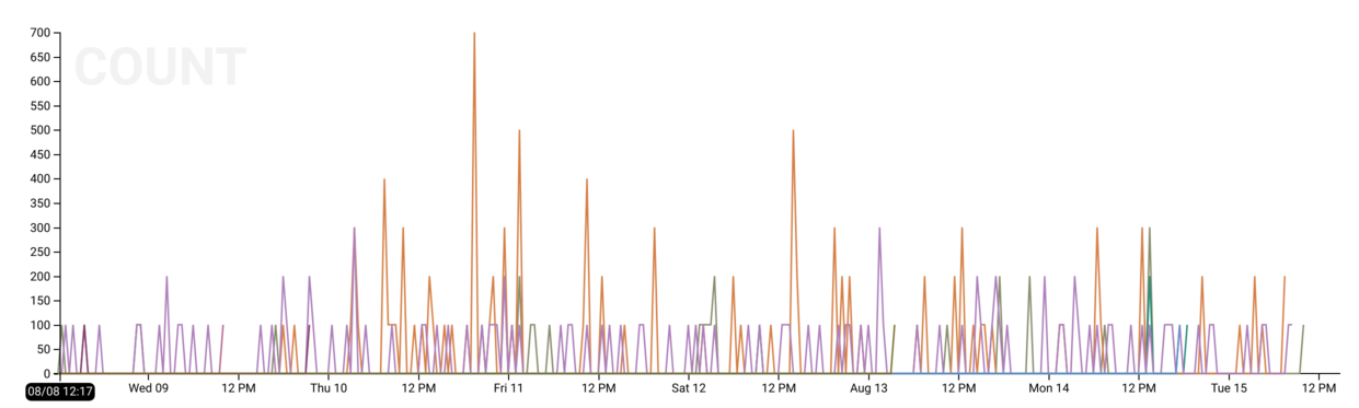
How about 500s (internal server errors)? We can hover over the 500 row in the
table view below the chart to highlight these specifically and identify a point
in time where there was a burst of 100 errors.
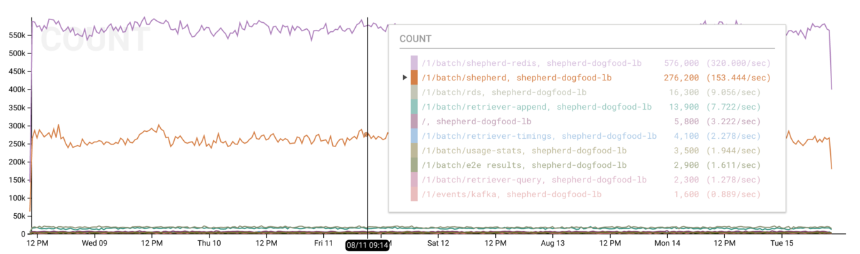
Which routes are getting the most traffic?
honeyelb will split the provided request information (e.g. path, status code,
user agent) into sub-fields for more fine-grained slicing and dicing. This more
granular request information includes a request_path field which illustrates
the URL pattern (such as /pets/cats/salem).
Therefore, if we:
BREAK DOWNbyelbBREAK DOWNbyrequest_pathCALCULATEtheCOUNTof each event
We will receive a COUNT for each combination of ELB and request path which
shows our most commonly visited routes. For instance, you can see below that the
purple and orange lines for /1/batch/shepherd-redis and /1/batch/shepherd
represent the vast majority of requests served by the shepherd-dogfood-elb
ELB.
Try it Out
We’d love if you sign up for a Honeycomb account
(if you don’t have one already) and try it out today.
Until next time, I’m sending good thoughts your way on your quest to become an
observability master.