Debugging INP With Honeycomb for Frontend Observability
In this post, I’m going to walk through how you can use Honeycomb for Frontend Observability to debug INP, which was just promoted to a stable Core Web Vital in March. The Honeycomb-specific steps in this post are applicable to debugging CLS and LCP as well, and Honeycomb’s instrumentation package captures attribution data for all three metrics.

By: Winston Hearn


It’s 2025, The Frontend Deserves Observability Too
Learn MoreInteraction to Next Paint is the newest of Google’s Core Web Vitals. The three metrics that make up the CWVs are Google’s attempt at defining proxy metrics for measuring things they believe are critical to a good user experience on the web. The three metrics are:
- Largest Contentful Paint: LCP is a proxy for how fast your page finishes loading. It measures how many seconds it takes for the largest element in view to fully render on page.
- Cumulative Layout Shift: CLS is a proxy for how much content on your page moves around as the page loads. It’s represented as a unitless score derived from how much of the page is affected by shifting content.
- Interaction to Next Paint: INP is a direct measurement of how fast the browser is able to respond to user input. It measures (in milliseconds) the time between an interaction (click, navigation, submit, etc.) and the next frame that the browser is able to render.
Debugging and fixing these metrics can be quite complicated. In this post, I’m going to walk through how you can use Honeycomb for Frontend Observability to debug INP, which was just promoted to a stable Core Web Vital in March. The Honeycomb-specific steps in this post are applicable to debugging CLS and LCP as well, and Honeycomb’s instrumentation package captures attribution data for all three metrics.
Understanding INP
As mentioned above, INP is a direct measurement of timing on the browser. Before we get to debugging, let’s unpack the metric a bit to understand what it means.
The reported metric
The people visiting your websites and apps will most likely interact with it more than once. They might be clicking, filling out forms, authenticating, and more over the course of their time on the site. Each one of those interactions generates an INP event, and each interaction may have a different score. For reporting, the worst score on a given page will end up being that page’s INP score.
This means that the reported INP metric is an aggregation of all the worst INP scores your users have seen. It also means that if you’re unable to disaggregate the metric in useful dimensions (Page URL, Components, Scripts that caused the issue), you will struggle to identify necessary fixes. Don’t worry—I’ll talk you through how to do that.
How the score is calculated on an individual page
This section is a summary of Google’s official article on INP where you can dig in further.
Google defines an Interaction as a mouse click, a tap (on a touch screen device), or pressing a key (on a keyboard or input device). As mentioned above, a user might do this many times on a given web page, so only the highest value (meaning, the longest single delay between interaction and next paint) is the reported value for the page.
The thresholds Google defines are:
- Good: the browser paints in 200milliseconds or less.
- Needs improvement: the paint takes between 201milliseconds and 500milliseconds.
- Poor: the paint takes over 500milliseconds (half a second).
How the score is calculated for your site
If you have thousands or millions of users, each time they visit your site they might generate an INP score. Those scores are all collected and aggregated to generate your overall score. Google reports at the 75th percentile for all of your page loads.
There are a couple caveats here, of course. The 75th percentile means that if you have a Good score, it could still mean 25% of your customers are dealing with Poor scores; Good does not mean perfect.
More importantly, INP only reports on Chromium-based browsers (Chrome, Edge, Arc) and does not report in Firefox or Safari. These two browsers aren’t the most popular on desktop, but on iOS, Safari is very dominant and will not be represented in your data.
How to debug INP
Now that I’ve covered how to understand the INP metric, let’s dig into how you can use Honeycomb for Frontend Observability to debug INP scores that need work.
By default, Honeycomb for Frontend Observability collects all attribution data for every Core Web Vital metric. Attribution data is all of the metadata surrounding a specific INP score. This is the data that Google’s web-vitals.js package captures that helps you debug your scores. Because every single INP event will have different information—interaction type, the element the user interacted with, the delay time (with component timing broken down), it’s necessary to have a product for debugging that can capture all of the information and make it available to you.
In Honeycomb, you have two ways to investigate INP (or any Core Web Vital metric):
- BubbleUp
- Querying
BubbleUp
Honeycomb’s BubbleUp is a powerful tool for asking what’s different between two groups of data, such as INP events rated Good and those rated Poor. In Honeycomb for Frontend Observability, you can easily access BubbleUp from our Launchpad by clicking on any of the bar charts highlighting Core Web Vitals:
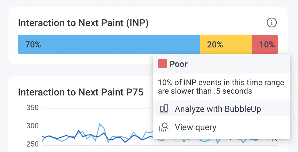
Once you click on “Analyze with BubbleUp,” you’ll land on a BubbleUp page where you’ll be able to see if there are any attributes correlated to Poor events but not Good events. That will help you identify your most likely places to optimize. In this screenshot, I’ve filtered down to the attributes that contain INP, which helps me see all the attribution data that we capture with every INP event:
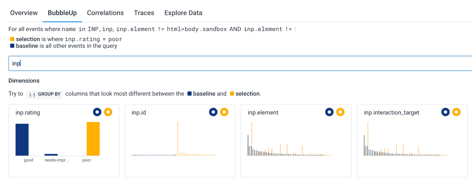
In the screenshot above, the inp.element and inp.interaction_target attributes tell me which element was clicked in order to lead to an INP event. You can see that there are some yellow spikes that are not matched by blue spikes. As seen in the legend, yellow relates to Poor events, and blue represents all other events. That means I can grab the values from the yellow spikes to see if they give me any further information.
Querying
BubbleUp is great when you’re exploring and need some pointers on where to start debugging. But Honeycomb also has really fast querying, which means we can iteratively explore our data to get to the hypotheses we want. I’ll show you how that works by exploring the poor INP events that we see today inside Honeycomb.
To start, you can click on the Interaction to Next Paint header above the distribution bar charts, or click “View Query” in the menu we previously used to access BubbleUp. That will take you to a query that is limited to only INP events.
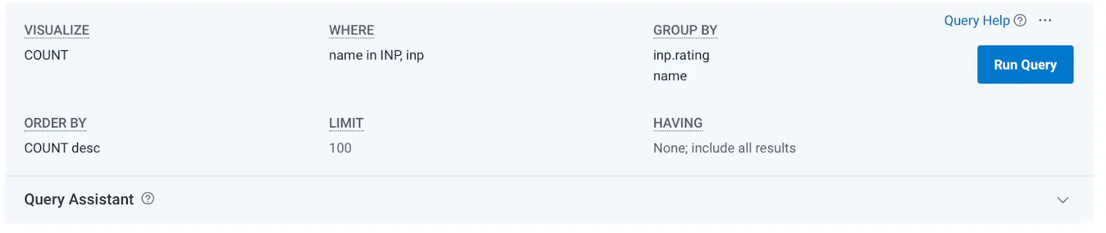
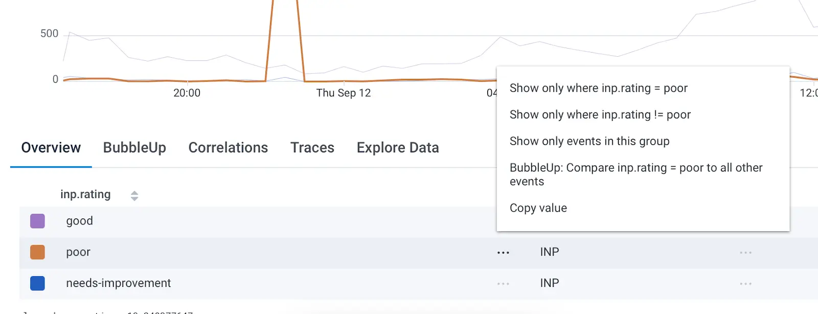
From here, let’s iterate on the query to see what insights we can get into the causes of our poor events. First, scroll down to the query results, then click the context menu, and select “Show only where inp.rating = poor.”
This limits our query to only the worst scores, but doesn’t help us find anything out about why we’re getting poor scores, which is our goal. The first bit of information we can add to the query is the inp.interaction_target. Click in the Group By box at the top of the query to type this out and choose the correct suggestion when you see it.
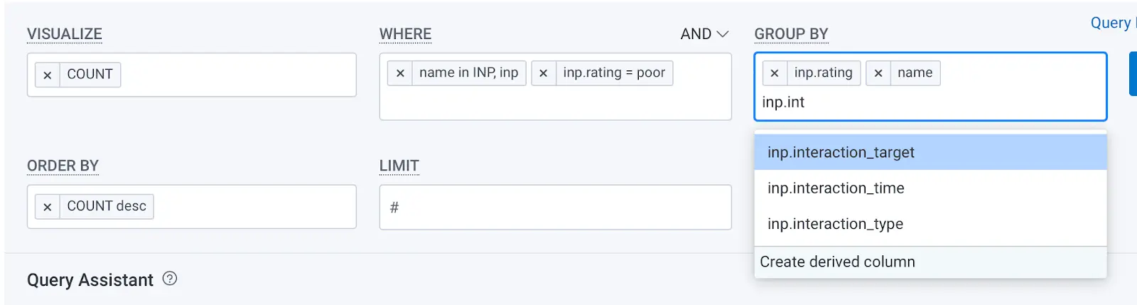
Running the query with this new Group By will break out all of our poor scores by the element that was interacted with, leading to the poor score. This information alone won’t give us insights, but it’s a helpful view into the distribution of scores.
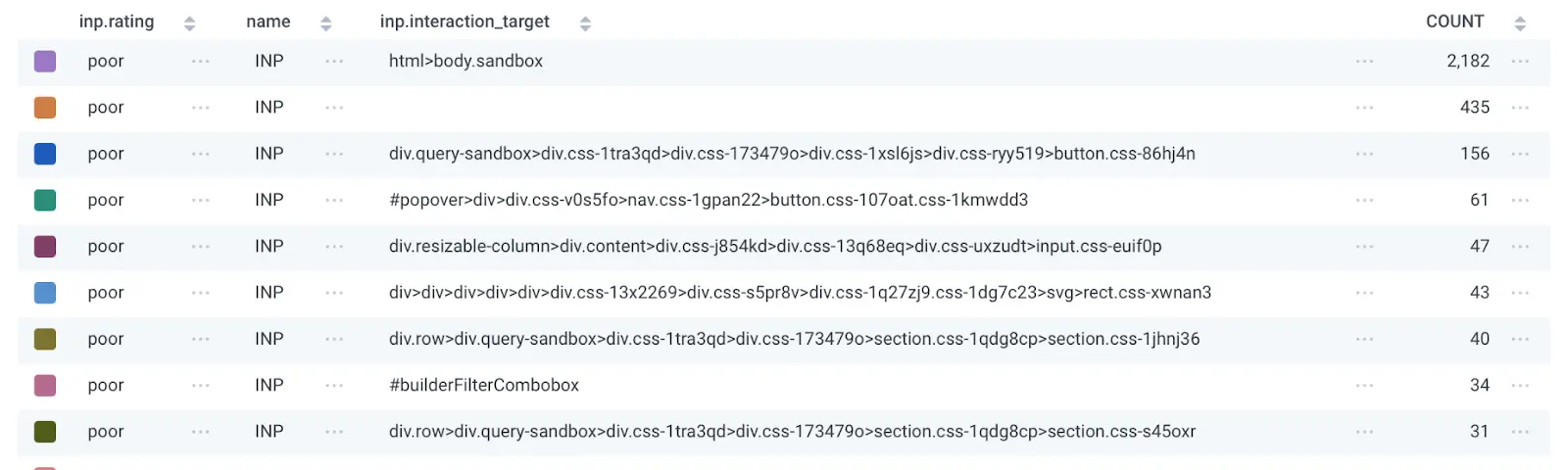
If your web service uses modern frameworks, you may have obfuscated CSS selectors (as seen in my screenshot), which means it’s very hard to search your codebase to find those elements. That’s ok—there’s still a lot of data we haven’t explored yet.
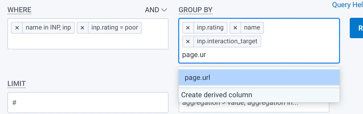
Every single INP metric that Honeycomb collects also includes a bunch of metadata. You can click on the Group By box again and add the page.url field to the query—not only will you get the CSS selectors, but you’ll also see which page they’re associated with.
I won’t screenshot my results with this field as it reveals customer information, but make sure you run the query with this as a Group By.
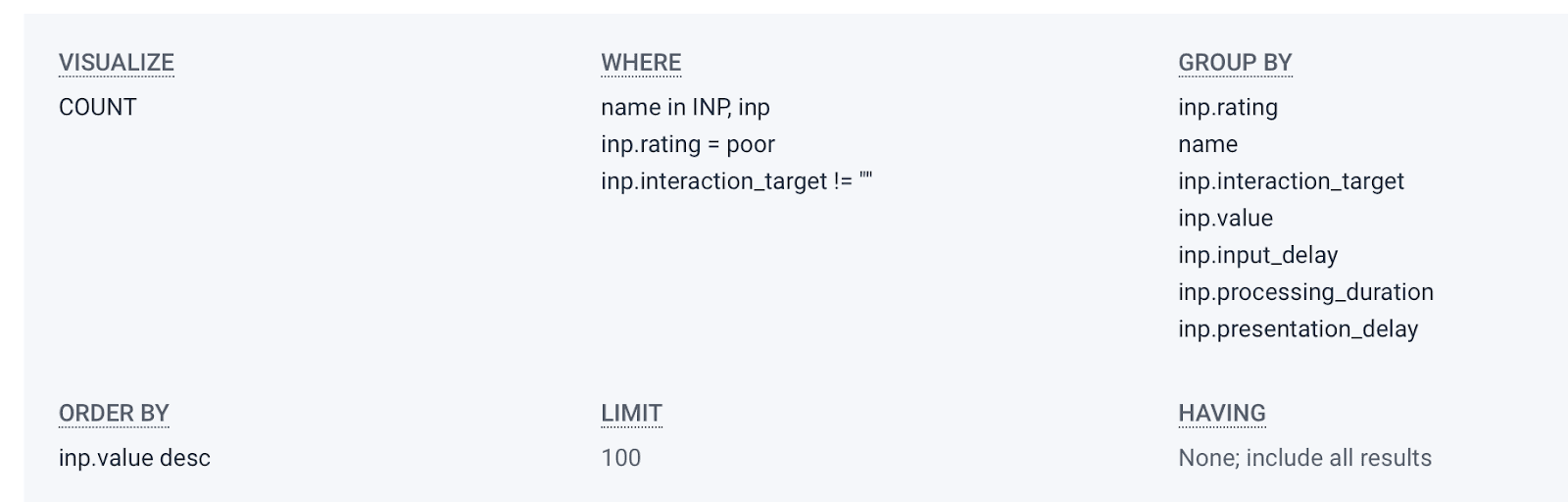
The next thing we want to do is get more context on how bad the Poor scores are, and where to investigate. To do that, we can add four more fields to the Group By. While there’s no requirement that you add them in this order, I find it’s helpful to do so. The fields are inp.value, inp.input_delay, inp.processing_duration, and inp.presentation_delay. It may also be useful to go ahead and sort by inp.value desc which will ensure the worst scores are listed first.
Rerun the query. Now we’re really ready to start debugging.
At this point, you have filtered down to only Poor-ranked INP events, and broken out your data in ways that will help you identify the most critical optimizations. Let’s briefly look at how to make sense of this.
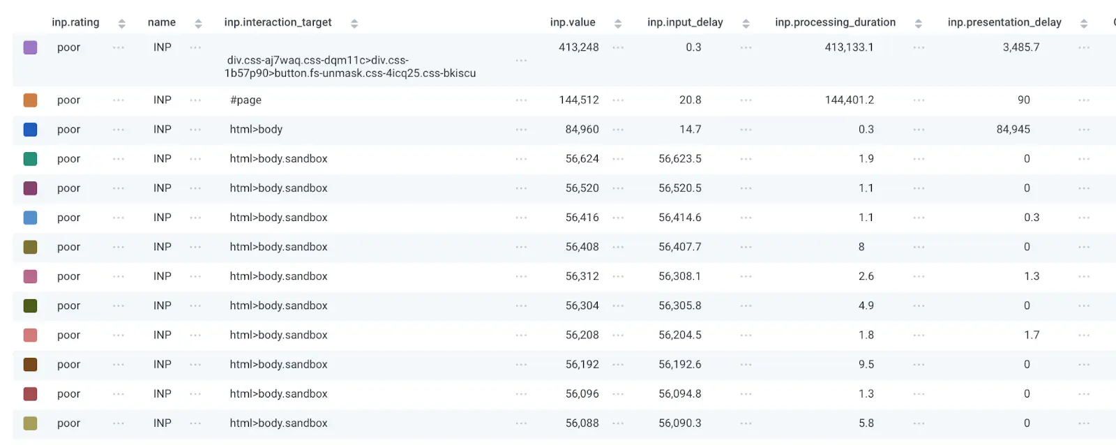
As mentioned, I’ve omitted the page.url field, but hopefully you also include that in your queries. Let’s walk through what each column can tell us.
- inp.interaction_target is the css element that was interacted with that led to the Poor score.
- page.url helps us know the page that the event came from, which should help us narrow down where to look in our codebase.
- inp.value is the overall INP score, which can help us determine how to prioritize the issue. In my screenshot above, the INP value is consistently high (56 seconds!) for the body.sandbox element, which probably means I should go try and look at event handlers and other Javascript code attached to that element.
- inp.input_delay is how long it took the browser to start firing the event handlers for the element. If this number is the highest of the last three fields, it’s likely that the optimizations you need to make are to find scripts that might block the main thread. This aspect of INP tells you that the browser was too busy at the moment of the interaction to respond to it.
- inp.processing_duration is how long it takes the browser to process all the logic associated with the event handler. The first two rows in my query results above show this field being the bulk of the INP time, which means whatever Javascript was executed in response to the interaction is slow and needs optimization.
- inp.presentation_delay is the time it took the browser to recalculate and paint the DOM after the Javascript processing has finished. If this number is the highest of the three fields, you’re likely changing too much of the page at once and the browser is struggling to do so performantly.
Once you have this query built out, you can easily filter down to specific pages by editing the query (using the same context menu that we used to limit to Poor events only) to refine your investigation, and you can also click into any specific INP event to see what other data is available by clicking on the chart visualization and selecting a trace.
Happy optimizing!
This query is a great starting point to help identify areas of optimization. Once you have a clearer idea of where in your codebase you need to start, Google has a number of pages available with tips on the actual optimizations that might improve things in your service.
If you have further questions or feedback, please join our Honeycomb Slack community, Pollinators, to find help from Honeycomb employees or other community members.
RUM can leave questions unanswered.
Honeycomb for Frontend Observability doesn’t.
Want to know more?
Talk to our team to arrange a custom demo or for help finding the right plan.