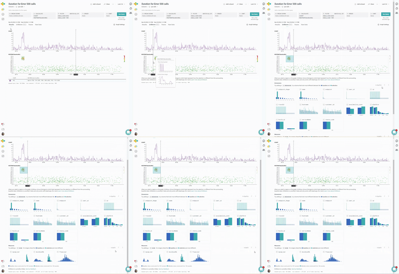
This blog miniseries talks about how to think about doing data analysis the Honeycomb way. In this episode, we announce an exciting new feature, currently in beta: BubbleUp! (formerly codenamed: Drilldown)

Let’s back up a little. In Parts I and II, I talked about how heatmaps help to understand how the process of data analysis works, and how to use them in the Core Analysis Loop; I talked about the Core Analysis Loop, and the importance of finding good dimensions that divide your data. In Part III, Honeycomb introduces a new feature that does precisely that: it helps you find those dimensions quickly and lets you know more about your data.
The last post talked about the Core Analysis Loop, and the importance of breaking down on good dimensions.
- Formulate a hypothesis about what the different groups might be: is there a variable that could explain why there are differences in the values?
- Break down across a dimension that would test that hypothesis
- Check whether that breakdown successfully separates the groups.
Honeycomb encourages you to create rich events, filled with lots of columns of data: it should be possible to look at your system from as many angles as possible. Many problems require users to understand the complexities of their data. Unfortunately, that makes step 2 difficult: how do you find the right dimension for a breakdown?
Sometimes, it’s possible to find a good dimension for steps 2 and 3 with some solid thinking. When a DevOps team owns their code, they know what to look for: cache misses look different from slow network requests. The dotted line from a misconfigured server looks different from the vertical slash of a DDOS attack.
But lots of the time, there’s a frustrating sequence that we have started to call the Breakdown Dance. “Does breaking down on this dimension make it look different? What about this one?”

That’s why Honeycomb has just released our latest new feature, BubbleUp.
BubbleUp is intended to help explain how some datapoints are different from the other points returned by a query. The goal of the BubbleUp is to try to explain how a subset of data differs from other data. Using BubbleUp can help identify where to look for signal within data.
The concept behind BubbleUp is to let the user see how data is distributed differently. Is that stripe of data all limited to one user id, or only database queries? The user selects a portion of their data, and BubbleUp computes histograms for every dimension and measure in the dataset, comparing the distribution of values. It then shows the top histograms that best explain how the selection is different from the surrounding baseline data.
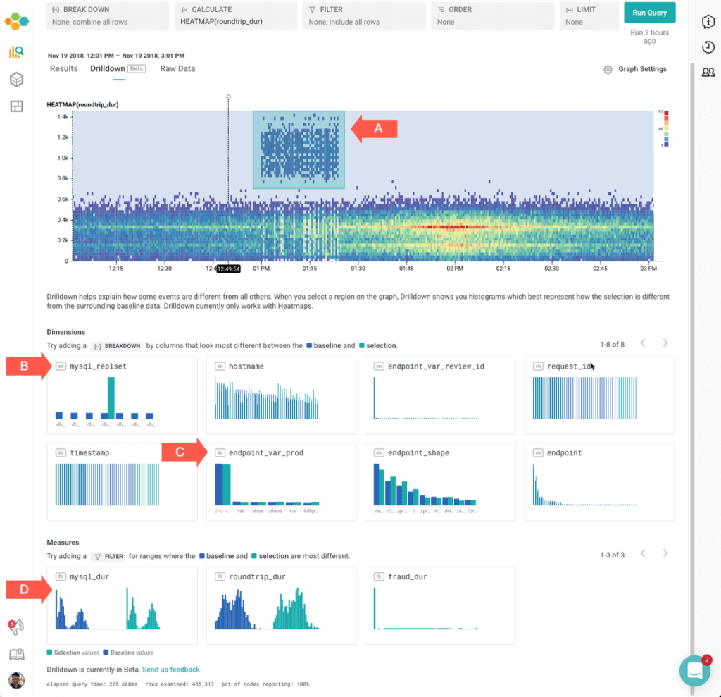
For example, consider the graph below, which shows the statistical distribution of roundtrip_dur over the selected time period. (This is a similar heatmap to that shown on “Using Heatmaps”; an article to help explain how to create a heatmap. To learn more about reading heatmaps, part I of this series — “Heatmaps make Ops Better” — explains how to read a heatmap). In this set, for example, the analyst might want to distinguish the strange group of events that have a surprisingly-high roundtrip_dur:

This screenshot shows that:
- (A) The user has selected the area ranging from about 12:45 pm to 1:25 pm
- The selected section is very different from the other data with regards to (B) which
mysql_replsetwas active during that section, but that the other fields, like (C)endpoint_var_prodandhostnameare fairly similar. - That the selected section is very different with regard to (D)
mysql_dur. (It is also very different with regard toroundtrip_dur, but that was the initial selection.)
This can help an analysis, as it helps figure out which fields are the most likely next starting points. In this case, it seems clear that one particular mysql_replset had a transient period of slowing down queries.
How to create a BubbleUp
Start BubbleUp by getting a heatmap on screen: something that involves a good continuous dimension, like a duration. (This sample query shows a request_body_size for RubyGems.) Then, click “BubbleUp [Beta]”. BubbleUp mode supports a rectangular selection tool. Click within the heatmap to select one corner, and drag to cover the opposite corner. The selection should cover some of the points that should be investigated. The selected area is called the selection; the entire area of the shown heatmap is the baseline. Try to select regions where things inside the selection are different from things outside it.
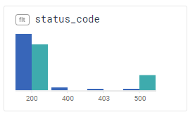
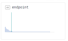
Now, look at the histograms below. Look for histograms where the green bars — the selection — looks very different from the blue bars.
In this chart, for example, lots of the selection data is status code 500 — while most of the non-selected data is status code 200. The selection consists of lots of internal errors!

In this chart, all of the selection data comes from one particular endpoint. (The tall green bar means “all the data”). It could be worth filtering down to that endpoint to figure out how it is different.

Read more about BubbleUp in the documentation.
The Core Analysis Loop, revisited
Now, let’s reformulate the Core Analysis Loop with BubbleUp:
- Identify points that are distinct, and can help highlight the new phenomenon.
- Create a BubbleUp, using those points as a selection, and narrow down candidate dimensions.
- Filter or break down on those dimensions.
That seems so much more predicatable!
Next time, we’ll look at how BubbleUp was created. We’ll look a little more deeply into some of our major design decisions, and talk through a few more usage scenarios.
BubbleUp is in Beta; we welcome your thoughts and feedback.
The team would like to gratefully acknowledge Professor Eugene Wu, of Columbia University, whose Scorpion research project helped us clarify our thinking on how to present and examine anomalous data.
Ready to try it out? Sign up for a free trial today!


