Using Honeycomb for Frontend Observability to Improve Honeycomb
Recently, we announced the launch of Honeycomb for Frontend Observability, our new solution that helps frontend developers move from traditional monitoring to observability. What this means in practice is that frontend developers are no longer limited to a metrics view of their app that can only be disaggregated in a few dimensions. Now, they can enjoy the full power of observability, where their app collects a broad set of data as traces to enable much richer analysis of the state of a web service.

By: Winston Hearn

It’s 2025, The Frontend Deserves Observability Too
Learn MoreRecently, we announced the launch of Honeycomb for Frontend Observability, our new solution that helps frontend developers move from traditional monitoring to observability. What this means in practice is that frontend developers are no longer limited to a metrics view of their app that can only be disaggregated in a few dimensions. Now, they can enjoy the full power of observability, where their app collects a broad set of data as traces to enable much richer analysis of the state of a web service. We are hard at work to expand Honeycomb for Frontend Observability to mobile devices as well.
At Honeycomb, one of our most important principles is that everything should be tested internally as soon as possible; we’re famous for saying we test in prod. In this post, I want to share how one of our engineers—Tanya Romankova—got curious about some data she saw in Honeycomb once we enabled Honeycomb for Frontend Observability’s Web Launchpad internally.
When you start sending data from your web services, the Web Launchpad shows you a few visualizations to help you get a sense of the data you now have available to explore. Here’s one of these visualizations:
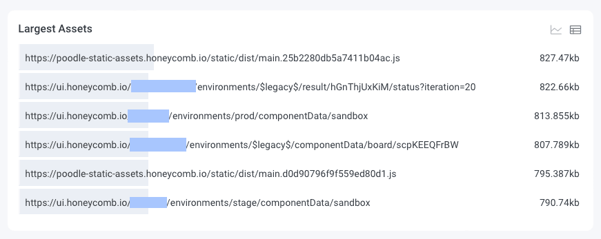
Our Largest Assets visualization groups all of the spans collected as part of a page load (including JS, CSS, images, and API requests) from the Performance API and displays them, ordered by the browser reported content size.
In the screenshot above, you can see two JS bundles as well as three API requests on various page loads. This chart is helpful for seeing the size of individual assets, to see if there are any unexpectedly large requests, which might be an area for optimization.
Improving Honeycomb
When Tanya started exploring this visualization, she noticed that we were reporting 1.5mb payload responses for certain customers. When the instrumentation rolled out, we only implemented it on the home pages in Honeycomb, so the API responses she noticed were not relevant to the areas of the app she works on. But she was curious: what makes the payloads so large?
Because Honeycomb for Frontend Observability captures dozens of attributes with every event fired, she was able to look at a representative trace and get more information, such as the exact page the response was loaded on. She was also able to compare the distribution of sizes to understand if this was a global issue, or specific to certain customers.
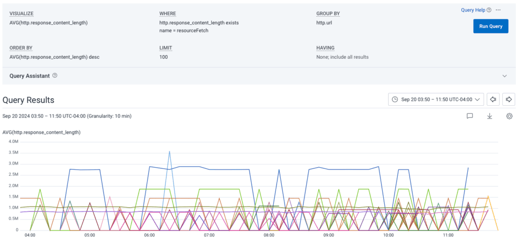
In the query above, the chart shows the average content responses, broken out by url. There are some clear outliers, and the urls in the query results (omitted for sensitive data) helped her confirm that the issue was customer-based, not global across Honeycomb.
At this point, Honeycomb has surfaced some abnormally large response payloads, and within a few minutes of clicking, Tanya had a clear sense from the data that the endpoints responsible for these payloads were optimized well for most customers, but for a few, they could use quite a bit of improvement.
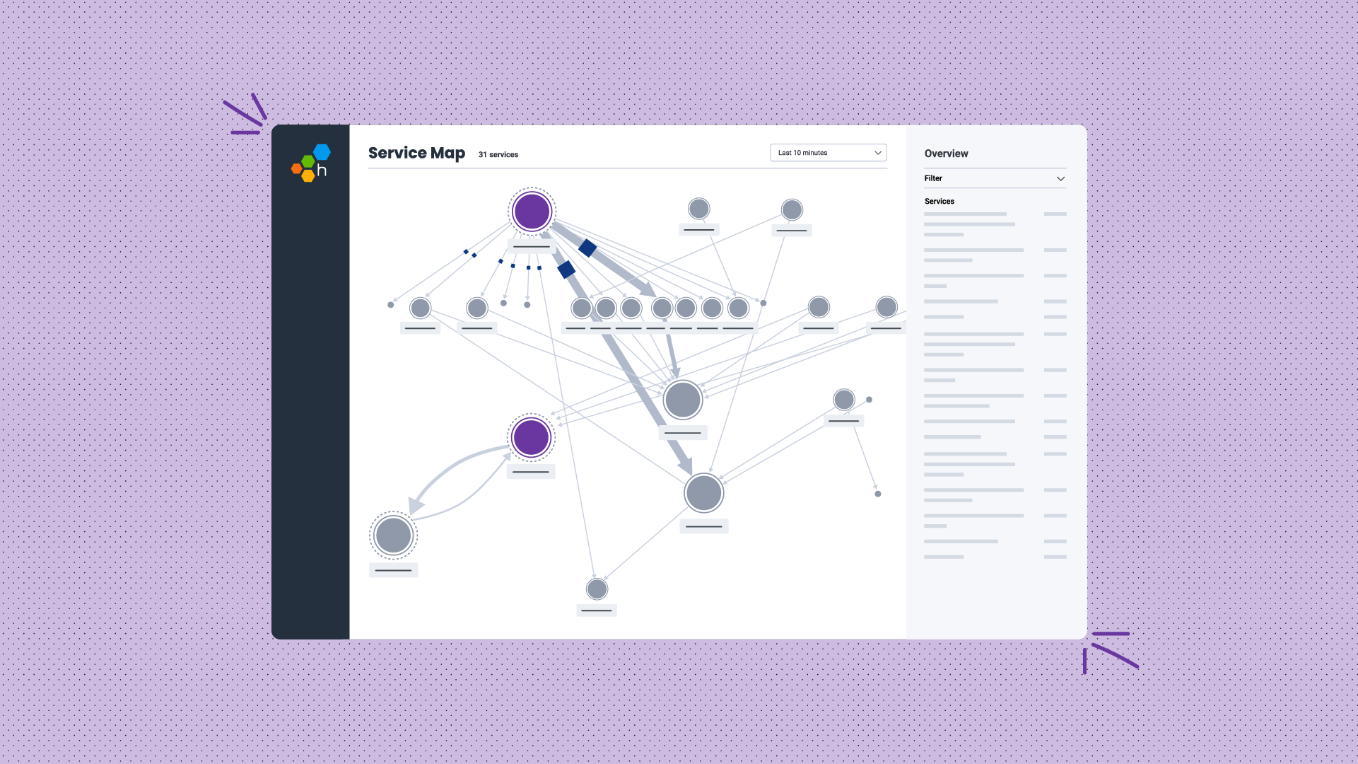
With a bit more investigation, she was able to confirm that a similar lack of optimization was present in our payloads for Service Maps, which Tanya’s team had been working on improving for a while.
Iterative improvements
Armed with data showing where the problem was, which customers were impacted, and how significant that impact was, Tanya started iteratively exploring optimizations to see how they improved those customers’ experiences.
The first experiment Tanya pursued was implementing a new cache feature our platform team had rolled out. This cache reduced lookup times for heavily queried information, like derived columns.
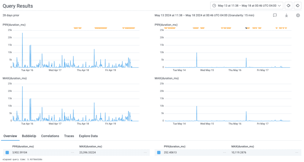
Along with using the cache, Tanya ensured that we were deduping data before returning the response to the client. Once these changes landed in Honeycomb, Tanya was able to use the query above to see that the P99 for Service Map load times dropped from 3.9s (with a max of over 23 seconds) to 250ms (milliseconds!), an improvement of 93%!
She wasn’t done yet.
After confirming how much that improved things, Tanya continued to optimize. She worked on reducing the total data sent by only responding with the fields necessary for the current request (we use REST APIs, not GraphQL, so the linkages between request and response are looser).
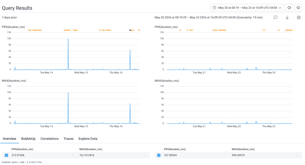
This reduced the P99 even further, from 213ms to 107ms—but what was most impressive was the MAX, which dropped from 10s to 1s!
So much impact in such a small thing
The overall impact of these optimizations is that some of our largest customers saw their Service Map load times drop from over 10s to less than a second, a massive improvement for their overall experience in Honeycomb. In response, the team was able to make their SLO for this interface much more aggressive, ensuring that moving forward we’re better able to monitor performance degradations for all customers.
Honeycomb for Frontend Observability offers a significant amount of data out of the box, and we’re excited to see what our customers learn about their systems once they have access to this rich and easy to explore data.
Want to know more?
Talk to our team to arrange a custom demo or for help finding the right plan.